Popular articles
- What Is Rivals of Aether? Game Type, Platforms, and Modes Explained
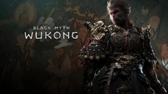
- Black Myth Wukong Guide – What To Expect From This Amazing New RPG
- Top 5 Gaming Thrones for a Luxurious Gaming Experience
- Is Sonic Triple Trouble 16-Bit Official? Who Is The Bad Guy in Sonic Triple Trouble?
- Among Us Original: Where and How To Play The Classic Game
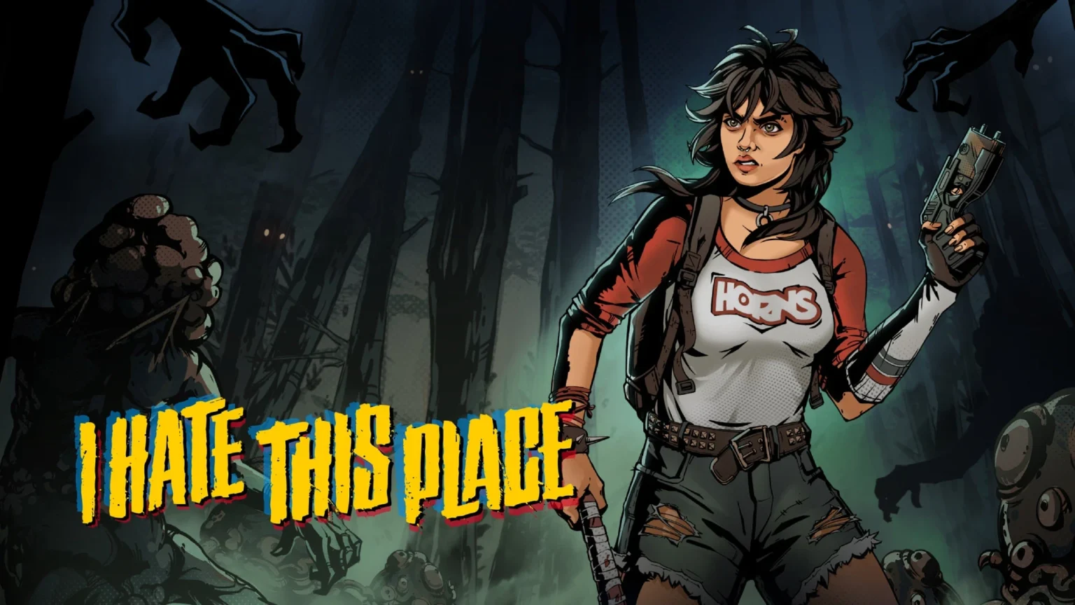
I Hate This Place Brings Comic-Book Mechanics to Survival Horror on Xbox Series X|S
Table of Content

The isometric survival horror I Hate This Place is out now on Xbox Series X|S, and it leans hard into the DNA of its source material. The game exists in the same universe as the “I Hate This Place” comics by Kyle Starks and Artyom Topilin, but tells a standalone story with its own cast. The team translates hallmarks of graphic novels into playable systems, not just surface-level visuals. Expect thick lines, saturated colors, and – crucially – sound cues you can actually see. The result aims to feel like navigating a tense comic panel by panel, but in motion.
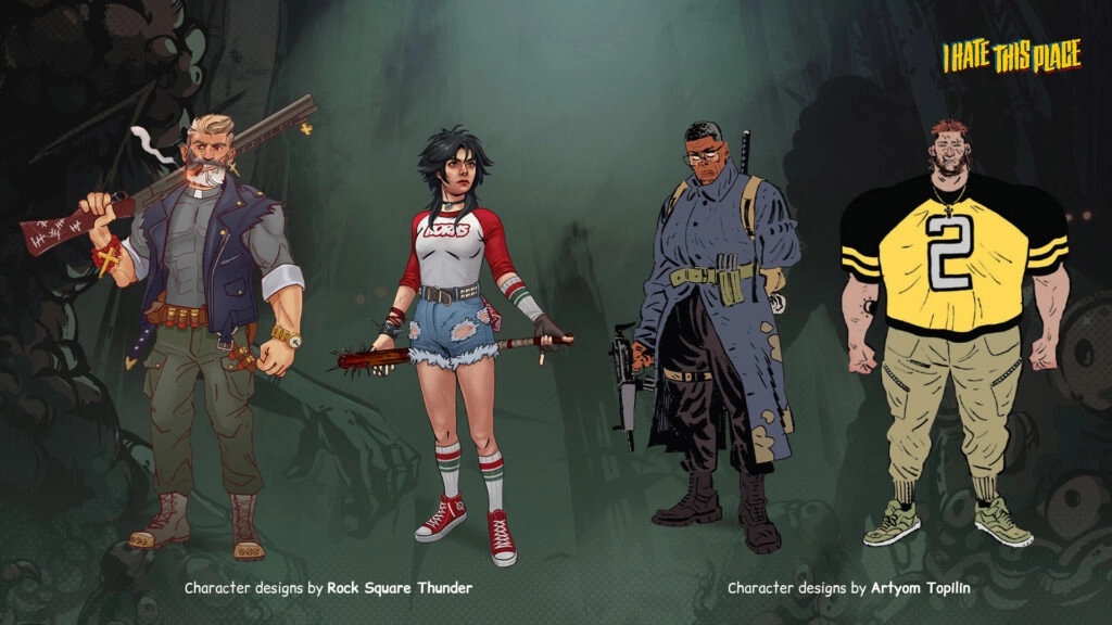
Shared Universe, Distinctive Art Direction
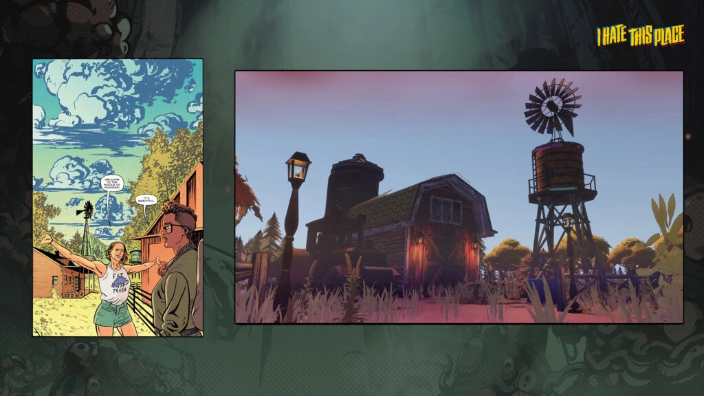
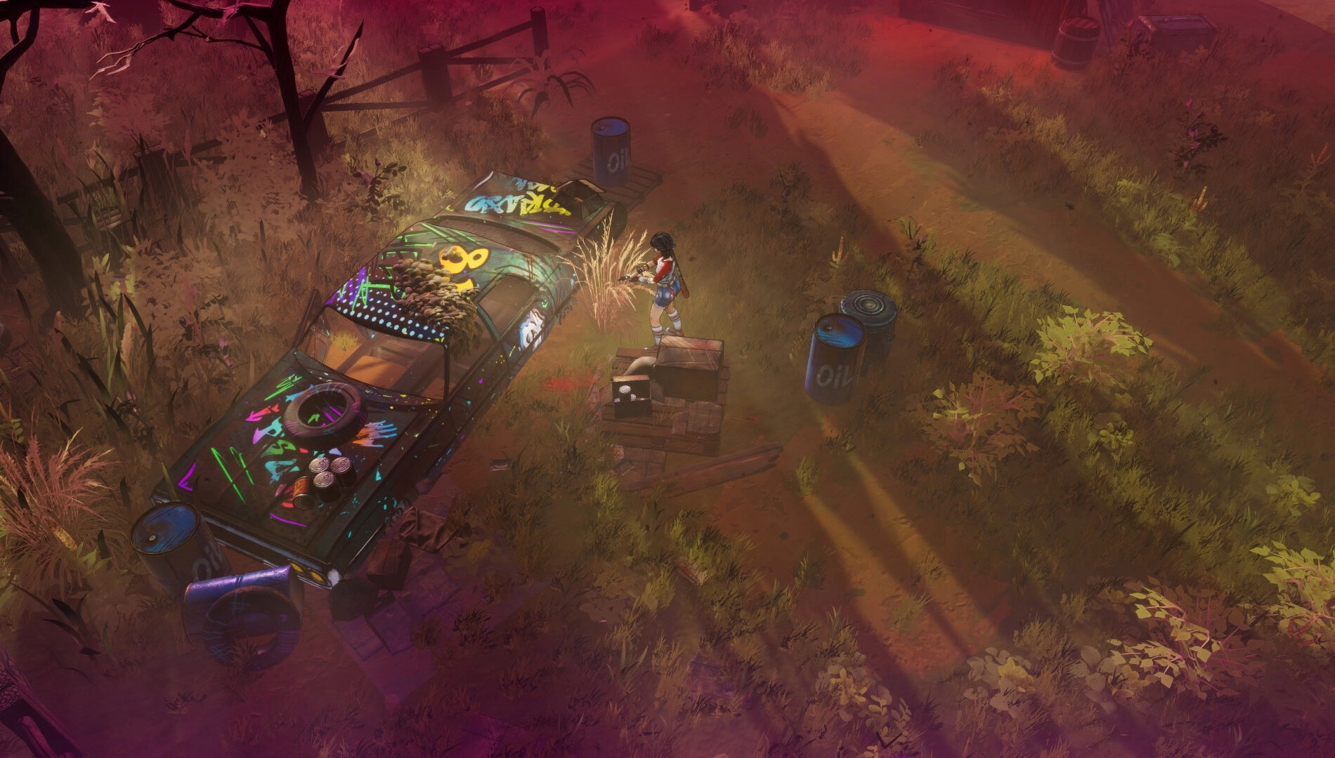
While the game stays faithful to the comics’ proportions, grounded tone, and overall vibe, it deliberately avoids copying the original look wholesale. The developers emphasize a more realistic base rather than a fully cartoony treatment. Where the game diverges is in shading approaches, line thickness, and a wider color palette – choices that help the artwork read clearly from an isometric perspective without losing the feel of the page.
Set alongside the 1980s timeline of the comics, the world design focuses on recognizably real spaces infused with the series’ uneasy mood. The art direction keeps the connection to the books visible while preserving room for a distinct identity tailored to interactive play.
80S Style, Turned up Loud
The 1980s backdrop shapes more than the narrative framing. Visually, the game embraces thick black outlines, high-contrast lighting, and punchy saturation to evoke that era’s bold comic aesthetic. Shadows are deep and intentionally placed, highlights are pronounced, and the presentation sprinkles in VHS-style static to underscore the period mood.
This is not a muted interpretation of horror – it’s a stylized, heightened one. The direction underlines shock and clarity over subtlety, making information readable at a glance while keeping tension front and center.
Sound, Visualized on-Screen
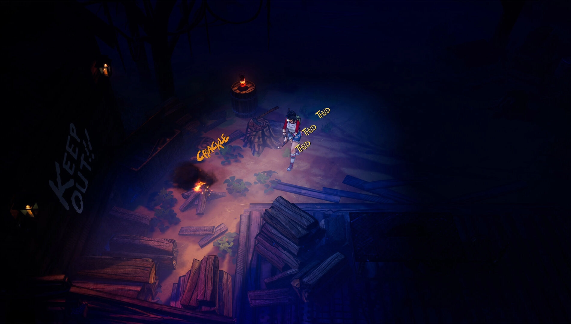
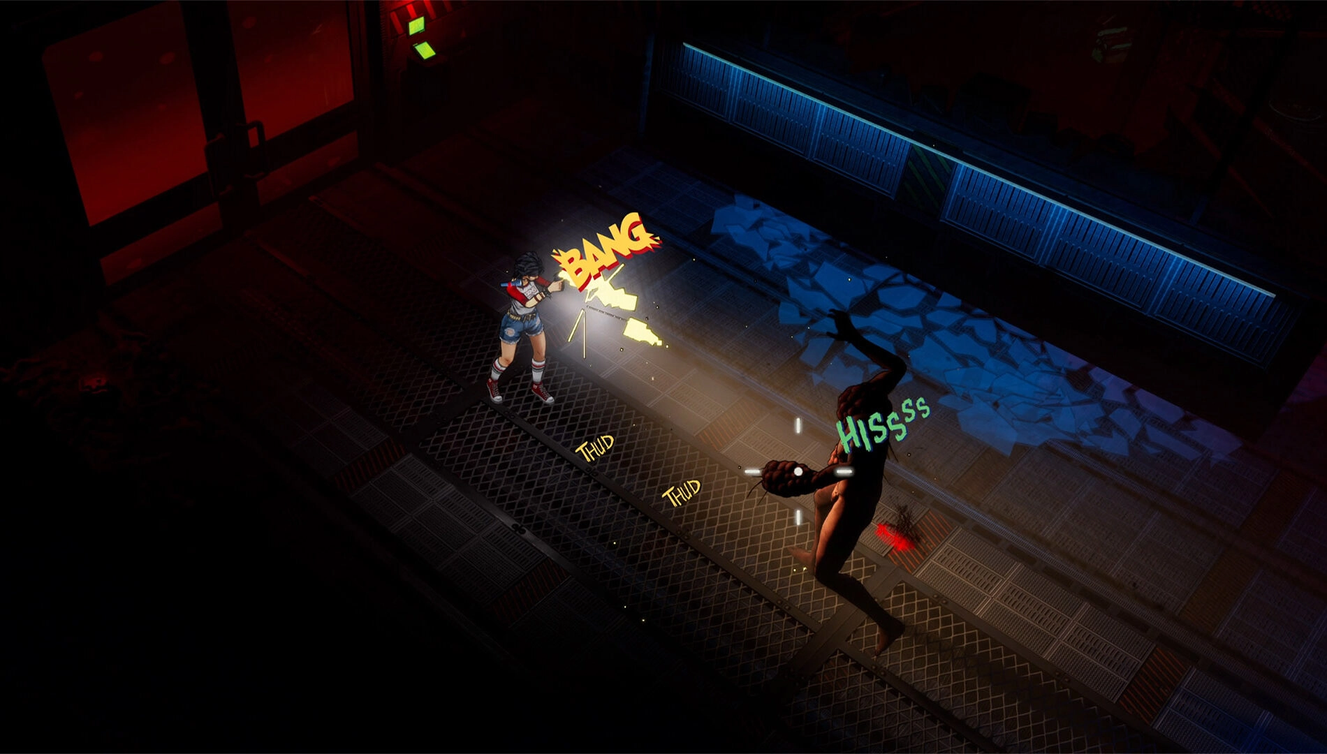
One of the headline ideas is that sound becomes something you read. Instead of relying solely on audio, noises appear as on-screen callouts styled like comic effects. Your movement generates “thud” markers whose color signals how much danger you may be attracting – a key system because many enemies track via sound.
- Green footsteps – quiet, crouched movement; reduced risk
- Yellow footsteps – normal pace; moderate noise
- Red footsteps – running or loud actions; high alert for nearby threats
Read also our article: Rare Brings Sea of Thieves to Webtoon with the Last Bite
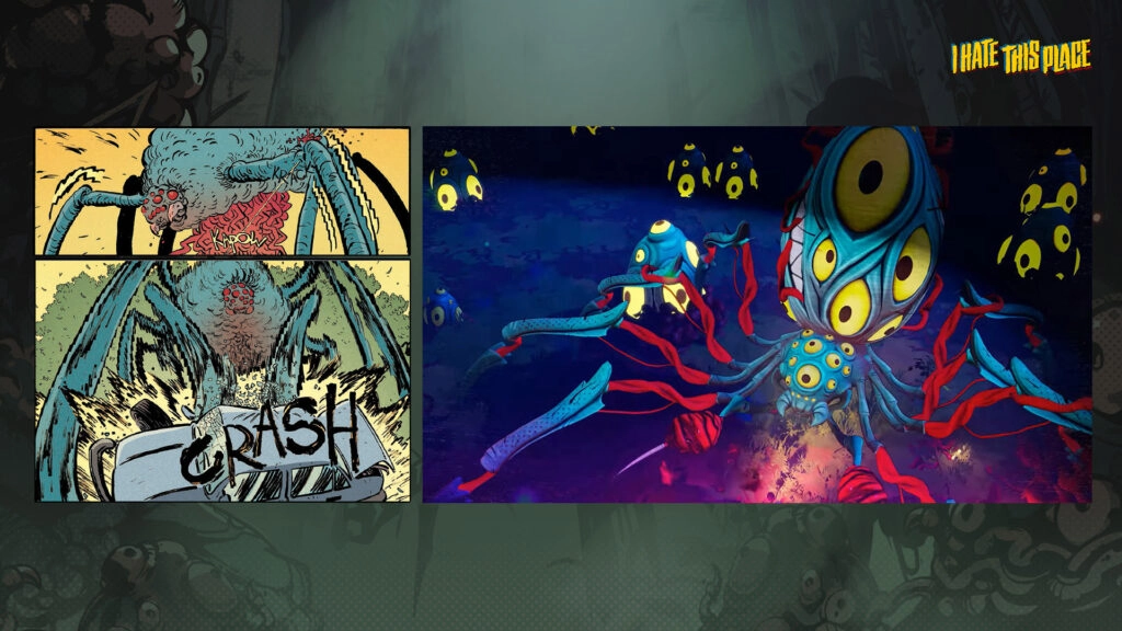
Weapons and creatures follow the same visual language. Gunfire throws out bold “bang!” and “ratatat!” effects across the screen, while monsters announce themselves with jagged, unsettling screech callouts. These cues layer with audio to make stealth and timing readable even in hectic moments.
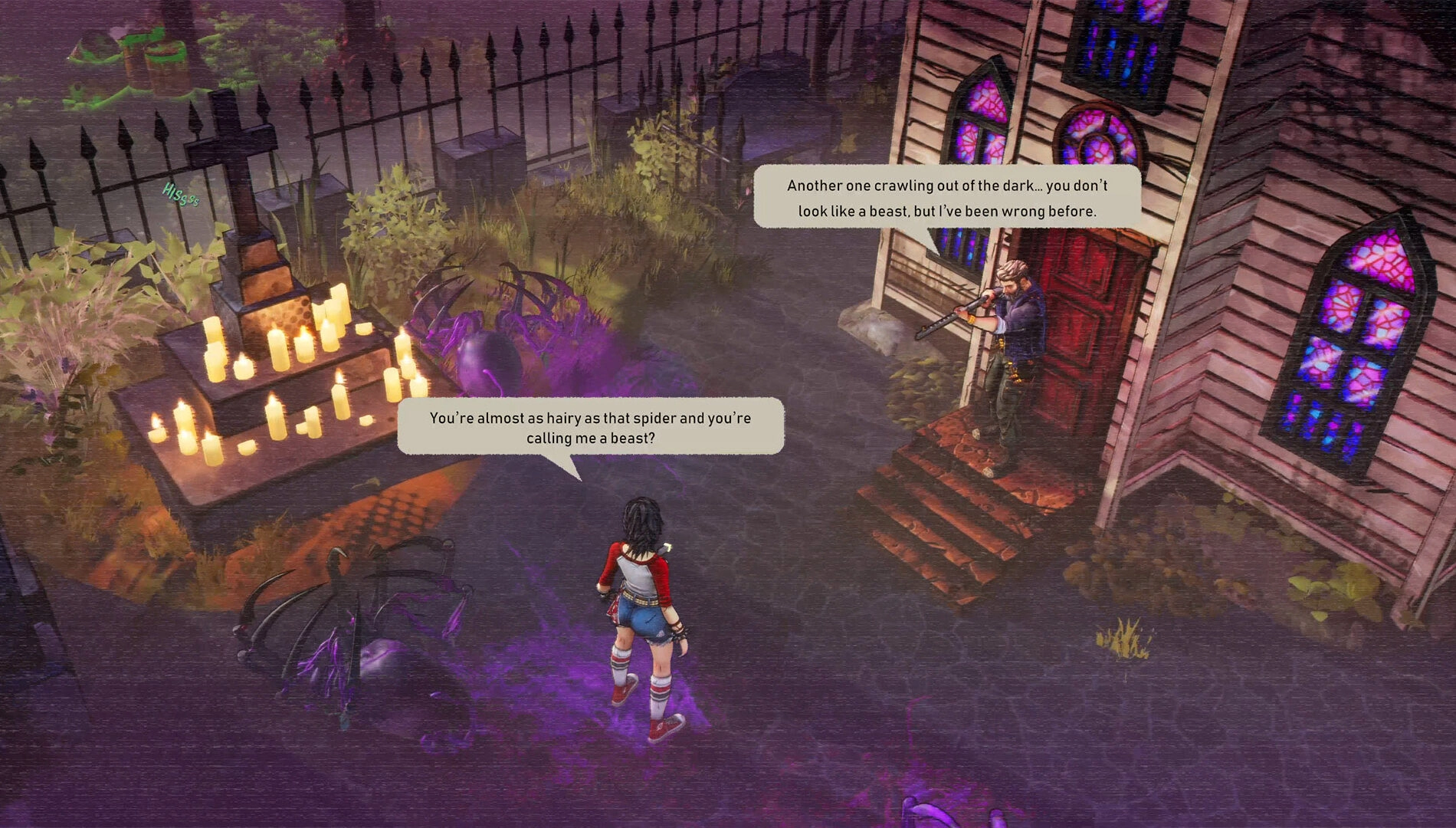
Speech Bubbles Replace Subtitles
Dialogue appears in speech bubbles above characters rather than standard subtitle bars. The approach reinforces the graphic-novel framing and keeps conversations anchored to the scene, helping players track who is speaking without looking away from the action.
Combined with the visualized sound system, these bubbles contribute to the sense that the entire interface is built from comic grammar repurposed for interaction.
Release Details
The game is available today on Xbox Series X|S. Its design centers on turning comic language – lines, colors, written sound effects, and layout conventions – into mechanics that guide attention and decision-making during play.
From universe continuity to visual systems, the project focuses on honoring the source while adapting it to an isometric survival horror framework.
Bottom Line: Reading the World as You Play
Why it matters: I Hate This Place pushes comic techniques beyond aesthetics, making them part of navigation, stealth, and combat. If you want a survival horror experience where information is visually legible and stylistically coherent, this release delivers a clear, comics-first design philosophy on Xbox Series X|S.


Meet the Author

Article:
Read all
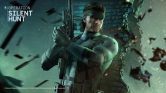
Solid Snake joins Rainbow Six Siege on March 3. Expect an intel-focused gadget, on-the-fly scavenging, a stealthy 4v4 event with Sam Fisher, and updates across maps and Operators.
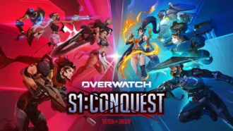
A year-long Overwatch narrative lands on Switch. Season 1 opens the Reign of Talon, adds 5 heroes, and introduces a 5-week faction event—setting the stage for updates through Season 6 in 2026.
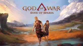
A new chapter in Kratos’ past arrives on PS5. Sons of Sparta shifts the series to 2D, exploring the Agoge with Deimos, classic Greek foes, skill trees, and Gifts of Olympus – all scored by Bear McCreary.
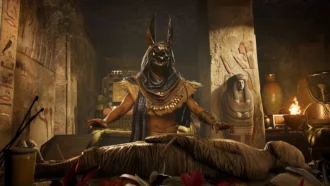
Assassin’s Creed Origins steps into the museum space as Ubisoft and the Musée de l’Homme unveil a nine-minute interactive walkthrough of ancient Egyptian embalming, part of the Mummies exhibition running November 2025 - May 2026.
Subscribe to “By-Gamers” on Telegram for gaming intel.
No filler, no fuss—just your daily XP boost. Hop in and level up, squad!


Read also
Solid Snake joins Rainbow Six Siege on March 3. Expect an intel-focused gadget, on-the-fly scavenging, a stealthy 4v4 event with Sam Fisher, and updates across maps and Operators.
A year-long Overwatch narrative lands on Switch. Season 1 opens the Reign of Talon, adds 5 heroes, and introduces a 5-week faction event—setting the stage for updates through Season 6 in 2026.
A new chapter in Kratos’ past arrives on PS5. Sons of Sparta shifts the series to 2D, exploring the Agoge with Deimos, classic Greek foes, skill trees, and Gifts of Olympus – all scored by Bear McCreary.
Assassin’s Creed Origins steps into the museum space as Ubisoft and the Musée de l’Homme unveil a nine-minute interactive walkthrough of ancient Egyptian embalming, part of the Mummies exhibition running November 2025 - May 2026.

High On Life 2 is out now, and its writers say the best gags start with the team cracking up first — then shaping bits so players help drive the punchlines. Here’s how Squanch approaches humor-by-design.
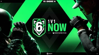
Rainbow Six Siege’s competitive year ends in Paris with a new twist: 1V1 NOW by Xbox Game Pass. Four regional standouts, 3.2k sign-ups behind them, clash Feb 14-15 for a share of $5,000 on the SI stage.
Fourteen Xbox titles arrive February 17-20 – from Star Trek: Voyager’s survival strategy to stealth in Styx and horror in Backrooms. Dates, platform notes, and core gameplay features inside.
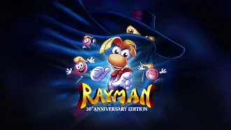
Rayman’s 1995 debut returns in a multi-version package – with a first-ever playable SNES prototype, 120 bonus stages, a reimagined Christophe Héral soundtrack, and modern assists like a 60-second rewind.
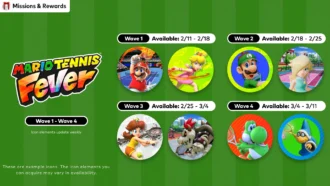
Mario Tennis Fever icon elements arrive on a ticking schedule—four waves across February-March 2026. Here are the exact PT dates, how to access them, and what the game brings to the court.

Nintendo serves up Mario Tennis Fever on Switch 2 with its biggest roster yet, 30 new Fever Rackets that twist rallies in wild ways, and a baby-themed Adventure Mode. Check the official trailer link inside.
Співпраця
Співпраця - текст
By-Gamers Newsletter!
Unlock special gaming deals, limited-time bundles, and more - sign up for By-gamers newsletter today!